 Session Recordings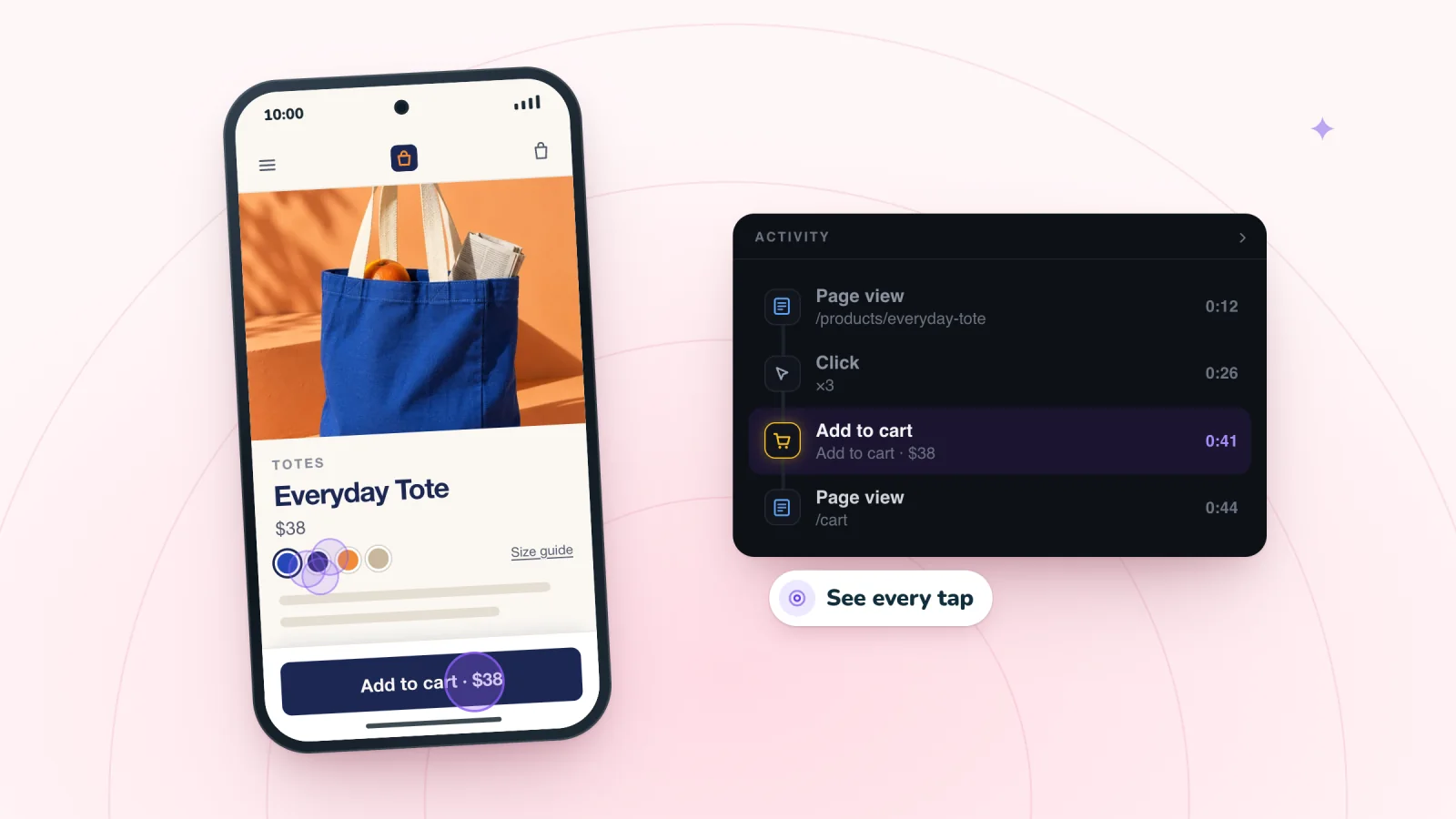
On this page
- Read phone replays with the screen in mind
- Tap targets that are too small
- Pop-ups that cover the page
- Sticky bars that eat the screen
- Text and photos too small to read
- Pages wider than the screen
- Images that load slowly
- Keyboards that cover fields
- Menus that hide the way forward
- Where to start
- Frequently asked questions
- Try it on your site
Your store may look fine on your own phone. You know where everything is, and you are not in a hurry. Phone visits from real shoppers show what happens when someone new tries to buy with one thumb, on a small screen, in between other things. Here are the mobile UX problems those replays reveal, and how to fix each one.
Key takeaways
- Watch where each tap lands compared with its target, and enlarge buttons that visitors miss.
- Delay pop-ups on phones, keep the close button large and on screen, and never cover the cart or checkout.
- Keep one sticky element on phones, two at most, so the product and buttons stay visible.
- Fill in every form on your own phone with the keyboard open, and test pages away from Wi-Fi.
Read phone replays with the screen in mind
Phone visits play back in the phone's own shape, with each tap shown. You see the same narrow view the shopper had, and where their thumb landed.
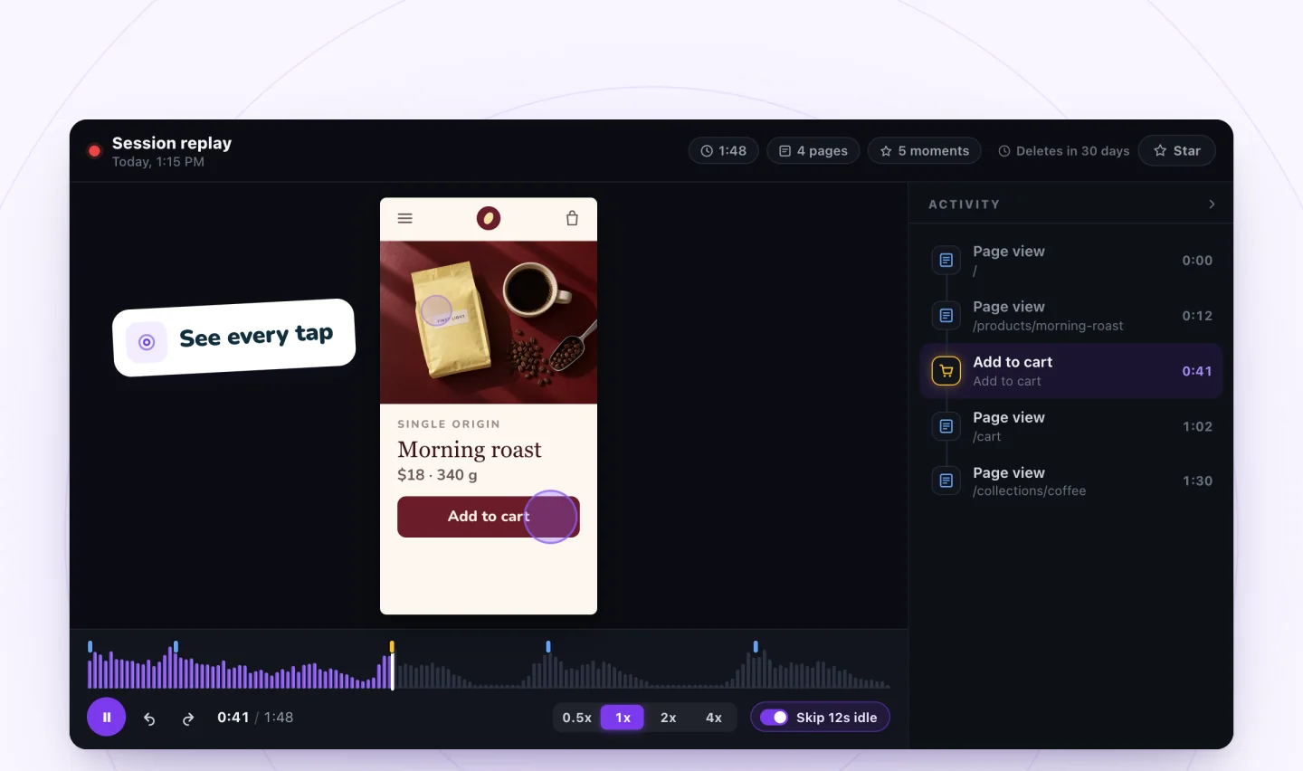
Three habits help.
- Watch where each tap lands compared with what it was aimed at. A tap just outside a button tells you the button is too small.
- Treat scrolling as the main way shoppers move, and watch its speed and direction.
- Pay attention to what fits on the screen at each moment. A button below the fold does not exist until someone scrolls to it.
Tap targets that are too small
In the replay. Taps land near a small link or icon and miss. The visitor taps two or three times before it works. Or they hit the wrong thing, like a Remove link sitting right next to the quantity button in the cart.
The fix.
- Make buttons and links big enough for a thumb, with space around them.
- Make whole rows tappable where it makes sense, like an entire product card.
- Keep actions that undo work, such as Remove, away from the buttons shoppers tap all the time.
Pop-ups that cover the page
In the replay. A pop-up appears. The visitor taps around its edges, tries to scroll the page behind it, taps the dark area outside it, and then leaves. On a phone, the close button might be tiny, tucked into a corner, or pushed off the screen.
The fix.
- Wait until the visitor has scrolled or spent some time on the page before showing a pop-up on a phone.
- Make the close button large, and keep it inside the visible screen.
- Consider a slim bar at the bottom of the screen in place of a full-screen box.
- Never show a pop-up on top of the cart or checkout.
Sticky bars that eat the screen
In the replay. An announcement bar, a sticky header, a cookie banner and a chat button all stay on screen at once. The product sits in a narrow strip between them. A tap meant for Add to cart opens the chat window, and the visitor has to find a way to close it.
The fix.
- Keep one sticky element on phones, two at most.
- Let the header hide as the visitor scrolls down and come back when they scroll up.
- Move the chat button so it never sits on top of other buttons.
- Let visitors dismiss the announcement bar.
Text and photos too small to read
In the replay. The visitor double taps a product photo, as if to make it bigger, and nothing happens. They stop on a block of fine print for a long time. They tap a promo graphic that has the offer details written into the image.
The fix.
- Let shoppers tap a photo to open a larger view they can swipe through.
- Set body text large enough to read without zooming.
- Put offer details in real text. Words baked into an image shrink along with it on a small screen.
Watch shoppers move from product to checkout
Store moments are marked on every replay, and filters find the carts that never became orders.
Add to Wix, it's free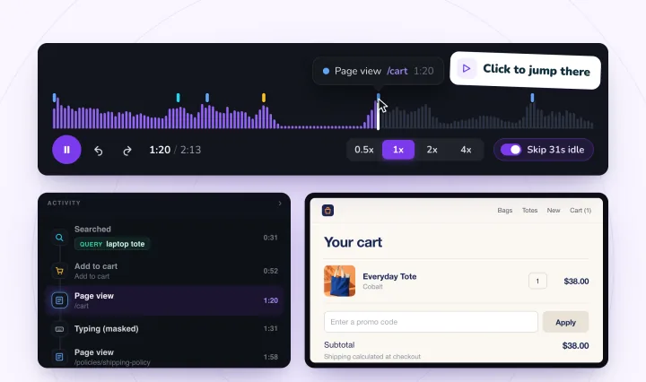
Pages wider than the screen
In the replay. The page slides sideways when the visitor scrolls, or text runs off the right edge. They drag the page left and right to read a single line.
The fix.
- Find the element that is too wide, such as a table, an embedded video or a large image, and make it fit the screen.
- Check each type of page on the smallest phone you can borrow.
Images that load slowly
In the replay. Slow images show up as behavior. A visitor scrolls a collection page, stops, waits, scrolls back up to a product they passed, and then leaves.
A page that loads quickly on your office Wi-Fi can crawl on a phone with a weak signal. Confirm what you suspect by opening the page on your own phone, away from Wi-Fi.
The fix.
- Resize photos to the size they appear on screen, and compress them.
- Put fewer large images at the top of long pages.
- Swap autoplay video near the top of a page for a still image the visitor can tap to play.
Keyboards that cover fields
In the replay. A visitor taps a field near the bottom of the screen. The page jumps. They scroll up and down, tap outside the field, then tap it again. On a page with a sticky bar at the bottom, the next field or the submit button stays hidden behind it.
The fix.
- Keep phone forms short, with one field per line.
- Remove sticky bars from pages with forms.
- Put the submit button right below the last field.
- Fill in every form on your own phone, start to finish, with the keyboard open.
Menus that hide the way forward
In the replay. The visitor opens the menu, opens a section, closes it, opens another, then closes the menu and searches instead. Or the menu runs longer than the screen, and they never scroll inside it to find the item at the bottom.
The fix.
- Keep top-level items few, with names a stranger would understand.
- Put your best-selling categories first.
- Add a search box at the top of the menu.
- Make it obvious the menu scrolls, for example by letting the last item peek out at the bottom.
Where to start
Begin with the pages phone shoppers land on. If you send texts with links, those visitors are likely on a phone. Tag those links with a UTM link builder for text campaigns so your analytics show which pages they reach, then watch replays of visits to those pages.
After you change a menu or a pop-up, watch visits live, a few seconds behind real time, to see the change in use right away. For phone issues on product pages, like option pickers and size guides, see how to improve your product page. For forms and payment steps, see a step-by-step checkout checklist.
Frequently asked questions
How big should tap targets be on a phone?
Big enough for a fingertip, with space around them. Common design guidance puts the minimum at roughly 44 to 48 pixels square. Size matters most for buttons shoppers use all the time, like Add to cart and quantity controls. Keep actions that undo work, such as Remove, well away from them, and check replays for taps that land just outside a button.
How do you test an online store on a phone?
Use a real phone, not just a narrow desktop window. Open each type of page, try the menu and search, fill in every form with the keyboard open, and go through checkout. Test away from Wi-Fi on a weaker signal, and borrow the smallest phone you can. Then watch replays of real phone visits for problems you would not think to test.
Should a mobile store have a sticky add to cart button?
It can help on long product pages, since the button stays within reach while shoppers scroll. Count it as one of your sticky elements, though, and keep the total to one or two on phones. Check that it covers nothing important when it appears, such as form fields or other buttons, and watch phone replays for taps that hit it by mistake.
Why is my online store slow on phones?
Often because of large images, autoplay video or extra widgets that load on every page, and a weak mobile signal makes each one worse. Resize photos to the size they appear on screen and compress them, put fewer large images at the top of long pages, and swap autoplay video for a still image. Then test the page on your phone away from Wi-Fi.
Try it on your site
Session Recordings plays back phone visits in the phone's own shape, with taps shown. Learn more on the phone recording page.

We build marketing apps for online stores: myuser.ai writes and sends emails and texts from a store's own products, and we make Session Recordings and Spin Wheel for Wix sites. Product details in our guides are checked against the apps themselves.