On this page
- Which visitors see the problem?
- Why does my Wix site look different on phones?
- Why is my Wix site not displaying properly on iPad?
- Why is my Wix site not working in Safari?
- Is an embed or custom code breaking the mobile layout?
- Find the pages that break for real visitors
- What can't a replay show?
- Frequently asked questions
- Try it on your site
- Sources
When a Wix site looks wrong on a phone, find out who sees it first: every phone, only iPhones, only tablets, or one browser. That tells you which layout to fix. On Wix Editor sites, phones get a mobile layout that Wix builds from your desktop one, and tablets, iPads included, get the desktop layout. Wix Studio sites switch layouts at breakpoints set by screen width instead.
For shopping problems on phones rather than pages that display wrong, such as small buttons and sticky bars that crowd the screen, see mobile problems on Wix stores you only see in replays. If it looks different on computers too, or the live site doesn't match the editor, start with why a Wix site looks different when published.
Key takeaways
- Find out who sees the problem first: every phone points to the mobile layout, only tablets to the desktop layout, and only iPhones and iPads to Safari's engine.
- In the Wix Editor, phones get a mobile layout that Wix builds from your desktop site and hides some elements on; check Hidden on Mobile before rebuilding anything.
- Tablets, iPads included, show the desktop version, so anything outside the editor's vertical gridlines can be cut off.
- Wix Studio picks a layout by screen width: Desktop from 1001px, Tablet from 751 to 1000px and Mobile from 320 to 750px.
- Embeds built for desktop can break on phones: hide the desktop element in the mobile editor and add a mobile-only one.
- A replay shows what was on the page at the visitor's screen size, but not how their browser drew it, so confirm Safari glitches on a real iPhone.
Which visitors see the problem?
The pattern points to the cause: every phone means the mobile layout, only tablets the desktop layout, and only iPhones and iPads Safari's engine. Check the page on two phones with different browsers, and on a tablet if you can, before you change anything:
- Every phone. The problem is in your mobile layout (Wix Editor) or at the Mobile breakpoint (Wix Studio).
- Only tablets and iPads. Tablets display your desktop version, so the problem is in the desktop layout at a narrower width. On a Studio site, check the Tablet breakpoint too.
- Only iPhones and iPads, in any browser. On iPhone and iPad, browsers such as Chrome use the same engine as Safari, so treat it as a Safari problem.
- Only older phones. As of May 2026, Wix supports iPhones on iOS 16 and later and Android phones on Android 10 and later.
- Only sideways. Wix says its sites are supported on phones in portrait mode.
- Only from a social app. Wix says visitors can view your mobile site inside in-app browsers such as Instagram's and Facebook's, so open your link from there too.
Before you go further, publish any saved changes and clear the phone browser's cache: Wix's first answer to a live site that doesn't match the editor is an unpublished change. To see how much of your traffic each kind of device brings, open the sessions-by-device chart in the Traffic Overview. If Google Analytics 4 is connected, its Tech details report splits visits by browser and operating system.
Why does my Wix site look different on phones?
Because phones get their own layout, and each editor builds it differently.
Sites built in the Wix Editor
Wix creates the mobile version from your desktop site: it resizes text and elements, and hides elements that aren't optimized for mobile, such as hover interactions and third-party apps. Elements can also be hidden when they sit outside the gridlines or there isn't room for them. Wix says its mobile algorithm translates desktop content for mobile but "it's not always perfect", and that can leave gaps.
Changes to your desktop site reach the mobile site, but changes you make on mobile stay on mobile. So an element you add on desktop can land somewhere odd on phones. To fix what you see:
- Open the mobile editor (the Mobile icon at the top of the editor) and click Hidden on Mobile to see what Wix hid and show it again.
- Drag elements into place, and shrink elements or shorten the page to close gaps.
- If a desktop element can't be made to fit, hide it on mobile and add a mobile-only element in its place.
Wix's Mobile Friendly setting (under Settings in the editor) should stay on. With it off, phones get the desktop version, and Wix doesn't provide support for problems that come from showing the desktop view on mobile.
Sites built in Wix Studio
Studio sites switch layouts at breakpoints, chosen by the width of the visitor's screen. The three built-in ones are Desktop (1001px and up), Tablet (751 to 1000px) and Mobile (320 to 750px), and you can add up to 3 more.
Design cascades downward: a change on Desktop reaches Tablet and Mobile unless you've overridden it there, and a change on Mobile stays on Mobile. Content changes, such as new text, a link or an image, apply at every breakpoint, as does deleting an element. Because the breakpoint follows width, an iPad Pro that's 1024px wide gets the Desktop layout, and turning a tablet sideways can switch it to another breakpoint.
For gaps and sideways scrolling, Wix's checklist is: elements sitting outside their section, edges that cross the page, and section heights set in vh or to Fit to screen. Setting the page's Overflow content to Hide clips anything that sticks out.
Why is my Wix site not displaying properly on iPad?
Because iPads and other tablets show your desktop layout, cropped to the tablet's screen. On Wix Editor sites, Wix lists these issues:
- Content cut off at the sides. Wix crops sites on tablets within the editor's vertical gridlines, which are 980 pixels apart. Move anything important inside them, or use full-width strips and columns, which adjust to the screen.
- Text on two lines. Fonts render differently on different devices, so one line can wrap. Widen the text box slightly to give it room.
- Hover effects. Tablet visitors can tap but can't hover, so anything that only appears on hover never shows.
- Video backgrounds and parallax. Wix says iPads and Android tablets don't support them, so they may not work there.
- Studio sites. The tablet's width decides its breakpoint, so check the Tablet and Desktop views for the widths your visitors use.
Find the moments worth watching
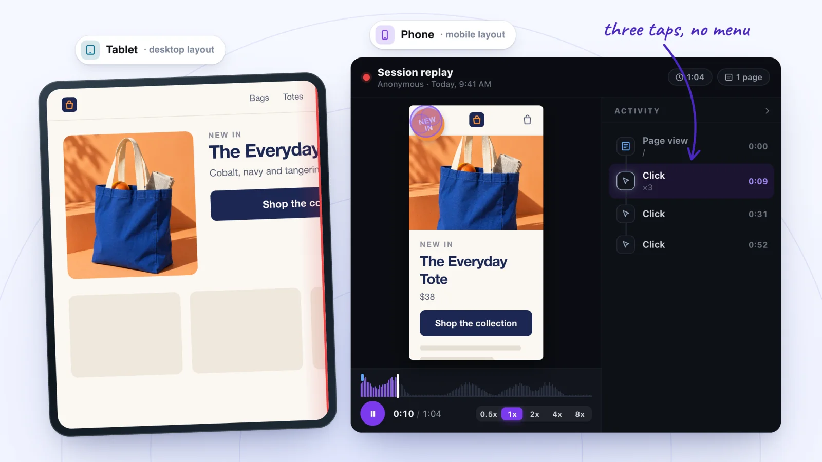
Jump to any moment from the Activity list, skip the quiet parts, watch at up to 8x and star the replays worth keeping.
Add to site, it's free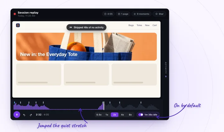
Why is my Wix site not working in Safari?
It may be a rendering bug on Apple's side rather than anything in your settings. Wix lists some as Known Issues with workarounds, so check there for your symptom, then go through these:
- Thin white lines across images on iPhone. Wix says this affects Safari 16 and later on phones and is a rendering issue on Apple's end. The workaround Wix says helped some users: in the mobile editor, hide all the components in your site's header, show them again, adjust the header if needed and publish.
- A sticky section scrolling over your header (Wix Studio). Wix's workaround is to change that section's position type from Sticky to Default.
- Text that wraps or aligns differently. Browsers use different rendering engines. Give text boxes room to spare, and don't place images on top of text boxes, since Wix doesn't support text wrapping.
- An old iPhone. On iPhone and iPad, the operating system version decides Wix support, not the browser, so a phone below iOS 16 is outside Wix's supported list.
Is an embed or custom code breaking the mobile layout?
It can be, especially when the broken part is a widget. Wix says embeds and custom elements from your desktop site may display differently on mobile, because some iFrames are designed for specific screen sizes:
- Cut off, or showing scroll bars. An HTML element shows its code inside a frame, and content bigger than the frame gets cut off. Resize the frame.
- Desktop-sized on a phone. Third-party code that isn't mobile friendly stays at its desktop size. Hide the desktop element in the mobile editor and add a mobile-only one with Add > Embed Code.
- Blank. Embedded code must use HTTPS, not HTTP, and some sites refuse to be shown inside a frame on any other site.
- Fine in the editor, wrong on the live site. Custom code can have unexpected effects, and the Wix Technical Assistant includes steps to disable custom code so you can test without it.
Wix doesn't support problems inside third-party code, so when the widget itself misbehaves, contact its provider.
Find the pages that break for real visitors
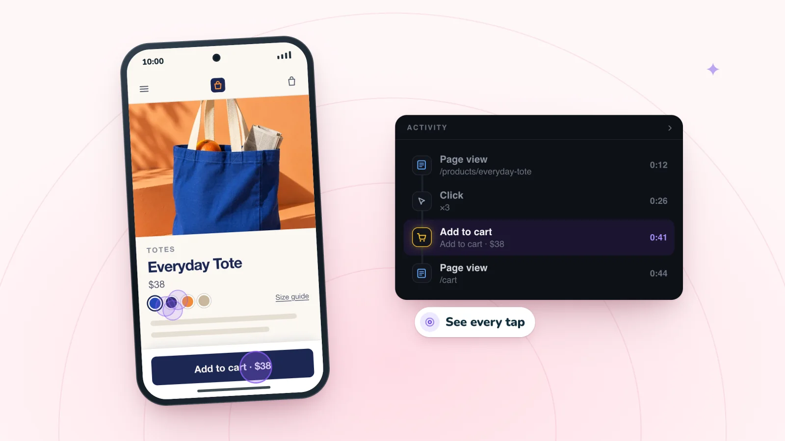
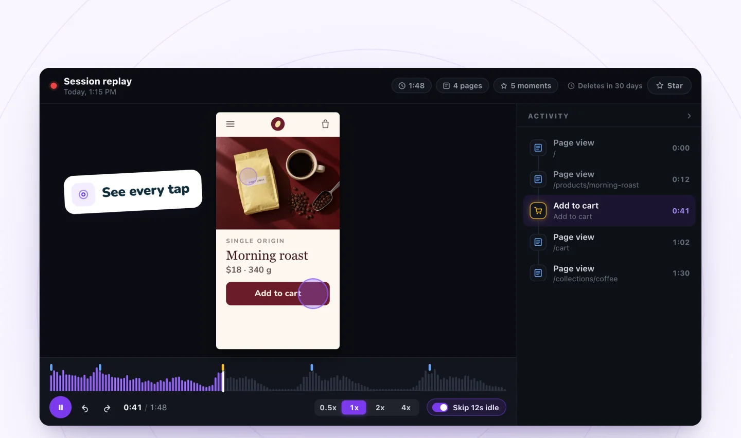
Your own checks cover the pages you think to check. Replays of real visits cover the rest. Session Recordings replays phone visits at the phone's own screen size, with each tap shown where it landed. The list doesn't say which device a visit came from, so open a visit and you'll see its shape.
A visit's first Page view row names the page it started on. To find visits that reached a later page, play them at 4x or 8x until that page comes on screen. Then watch for:
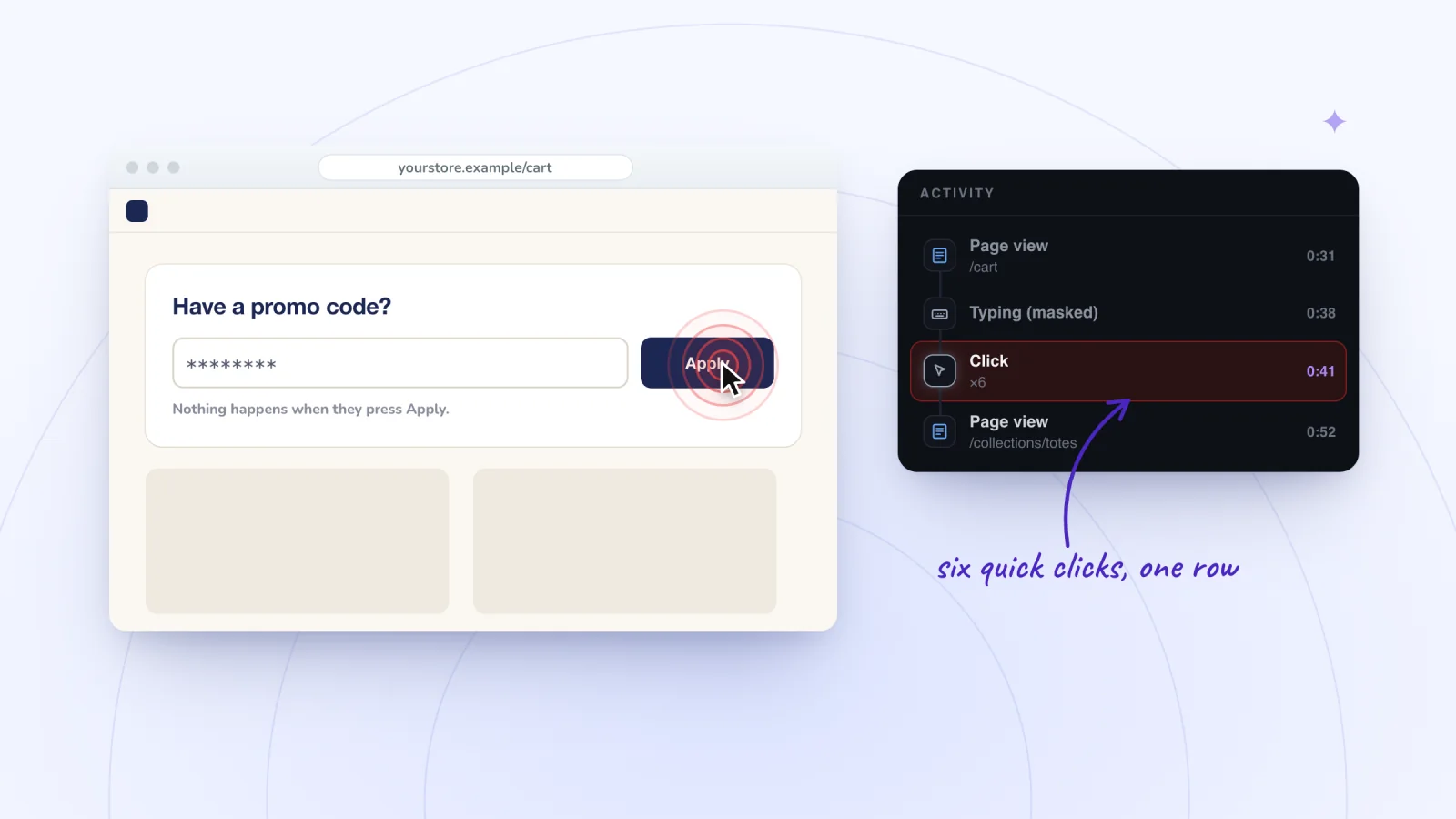
- Taps that get no response. Quick taps in a row merge into one Click row with a count, such as ×3. On a menu icon, that can mean the page hadn't finished loading, since Wix says the mobile menu doesn't respond until it has, or that an image sits on top of the icon. Rage clicks on Wix covers what to look for.
- A page that shifts sideways. If the page slides left and right as the visitor scrolls, something on it is wider than the screen.
- A form that never sends. Repeated taps on Send can mean a required field is hidden on mobile: Wix warns against hiding required input elements on mobile or at a Studio breakpoint. What stops a Wix form from submitting lists the other causes.
- Visits that end on the same screen. Click the timeline just before a short visit ends to see the last thing the visitor saw. If several end on the same section, start there.
What can't a replay show?
How the visitor's browser drew the page. Session Recordings is built on the rrweb library, which rebuilds the recorded page inside a frame in your own browser. So a replay shows what was on the page at the visitor's screen size: hidden elements, overlapping blocks, a section that never loaded. It doesn't show how their browser painted it. Watch an iPhone visit in Chrome on a laptop and a Safari-only glitch, like the thin white lines above, won't appear, and text that wrapped on their screen may not wrap on yours. The phone's keyboard isn't in a replay either, and content inside an embed loaded from another site shows as an empty area, so a blank widget in a replay doesn't prove it was blank for the visitor.
Check on a real phone
- Open your published page on an iPhone in Safari and on an Android phone in Chrome, and repeat what the visitor did.
- Turn the phone to portrait if it isn't, and try the same page on a tablet if one is involved.
- If you have a Mac, inspect the iPhone's page directly: on the iPhone, go to Settings > Apps > Safari > Advanced and turn on Web Inspector, connect it with a cable, then pick the page from Safari's Develop menu on the Mac.
- Use Chrome DevTools' device mode on a computer to try other screen widths, keeping in mind that Google calls it a first-order approximation: it doesn't run your page on a phone.
Frequently asked questions
Why is my Wix website not responsive?
Sites built in the Wix Editor are only partly responsive, in Wix's own words. Full-width strips, sections, galleries and many Wix apps stretch with the screen, but text boxes, images and shapes keep their size, phones get the separate mobile layout and tablets get the desktop one. Sites built in Wix Studio are responsive, with a layout for each breakpoint.
Why does my Wix site show the desktop version on my phone?
Check that the mobile-friendly view is on. In the Wix Editor, click Settings, then Mobile Friendly, and switch it on. With it off, phones show the desktop version, and Wix doesn't support problems that come from that. Tablets show the desktop version either way.
Why is my Wix form not showing up on mobile?
It may be hidden from your mobile site, since Wix hides some elements automatically, such as ones outside the gridlines or without enough room. Open the mobile editor, click Hidden on Mobile and show it. If the form shows but won't send, check for overlapping elements, and make sure no required field is hidden on mobile.
Why isn't my mobile menu working on Wix?
Wix lists these causes: the page hasn't finished loading, since the menu responds only once it has; another element, such as an image, overlaps the menu icon; every page is hidden from the mobile site; the domain isn't properly connected; or the menu needs updating. Bring the menu icon to the front with Arrange > Bring to Front, and update the menu if its settings offer Update now.
Try it on your site
To find the pages that misbehave for real phone visitors, add Session Recordings and open the visits that replay in a phone's shape. More on recording phone visits on Wix.

Sources
All checked October 5, 2026.
- Wix: Supported Devices, Browsers and Operating Systems
- Wix Editor: Troubleshooting Mobile Live Site Issues
- Wix Editor: Viewing Your Wix Site on Your Mobile Device
- Wix Editor: Differences in Live Site and Editor
- Wix Analytics: Understanding the Traffic Overview
- Google Analytics Help: Tech details report
- Wix Editor: About the Mobile Editor
- Wix Editor: About the Mobile Version of Your Site
- Wix Editor: Troubleshooting Layout Issues on Your Mobile Site
- Wix Editor: Hidden Elements in Your Mobile Editor
- Studio Editor: Designing Across Breakpoints
- Studio Editor: Troubleshooting Gaps and Horizontal Scroll Bars
- Troubleshooting iPad and Tablet Live Site Issues
- Wix Editor: Working With the Editor Gridlines
- My Site Looks Different on Other Devices and Screens
- Wix: Known Issues
- Thin White Line Appears Across Images on iPhone (Includes Workaround)
- Section with Sticky Position Overlaps Global Section in Safari (Includes Workaround)
- Wix Editor: Adding Embeds and Custom Elements to Your Mobile Site
- Wix Editor: HTML Code on Mobile
- Wix Editor: Troubleshooting an Unresponsive Mobile Menu
- Wix Forms: Troubleshooting
- CMS: Troubleshooting User Input Element Issues
- Wix Editor Request: Responsive Sites
- Creating Responsive Sites With Wix
- rrweb: sandboxed replay
- Apple Developer: Inspecting iOS and iPadOS
- Chrome for Developers: Simulate mobile devices with device mode

We build marketing apps for online stores: myuser.ai writes and sends emails and texts from a store's own products, and we make Session Recordings and Spin Wheel for Wix sites. Product details in our guides are checked against the apps themselves.