On this page
A published Wix site usually looks different because the live site isn't the version you're looking at in the editor: your latest changes were saved but not published, or your browser is showing an older copy from its cache. Once the live site is current, most differences come from the screen. Wix Editor sites keep their content in a 980-pixel-wide area that wider windows surround with space, Wix Studio sites can scale with the window up to a max width, and browser zoom or display scaling changes how much of the page fits.
This guide is about computers. Phones and tablets have causes of their own, from the separate mobile layout to Safari; for those, see Wix site not displaying properly on mobile.
Key takeaways
- A live Wix site that doesn't match the editor is usually an older version: Wix says saved changes don't go live until you click Publish, and a cached copy can hide the ones that have.
- Wix Editor sites keep text, images and shapes the same size inside a 980-pixel area while strips and sections stretch with the window, so a wide screen shows more space around the same content.
- Wix Studio sites switch layouts at breakpoints and grow elements that scale proportionally until the site's max width, 1600 pixels by default, then add side margins.
- Zooming in leaves a page fewer CSS pixels to fill, so a zoomed browser can get a narrower layout; a replay rebuilds each visit at the window size the visitor's browser reported.
Why doesn't my live site show my changes?
Usually because they aren't live yet, or your browser is showing an older copy. Wix says changes you save in the editor or see in Preview don't reach the live site until you click Publish. If you have published, Wix suggests a private window, clearing your cache or another browser, then publishing again.
- Not published. In the Wix Editor, Save doesn't make changes live. Wix Studio and Wix Harmony save as you work, but in every editor only Publish updates the live site.
- A cached copy. When a change shows in Preview but not on the live site, Wix says it can be a caching issue. If the change shows in a private window, clear your browser's cache.
- The wrong page. Make sure the page open in your editor is the one you're checking on the live site.
- Someone saved over your changes. Site history lists every saved and published version with the email of whoever saved it, and you can restore one. Restoring erases the changes made after that version.
- A domain you've just connected. Wix says it can take up to 48 hours for your site to appear at your own domain.
- An outdated browser. Wix says outdated browsers can show rendering differences between the editor and the live site. It supports Chrome, Edge, Firefox and Safari, and recommends their latest versions.
Why does my Wix site look different on different computers?
Because each computer gives the page a different amount of room. Screen size, window size, browser zoom and display scaling all change how much of a page fits, and the Wix Editor and Wix Studio respond to the window's width in different ways. Browsers also draw text slightly differently, so a line can wrap in one browser and not another.
Sites built in the Wix Editor
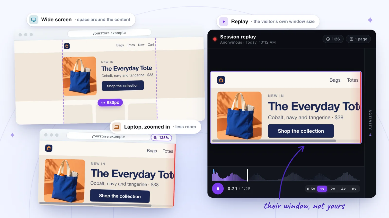
The area between the editor's gridlines is fixed at 980 pixels. Sections, strips and other full-width elements span the browser window and adjust to it, but text, images and shapes stay the same size on every screen, so a wider window shows the same content with more space around it. Wix notes that the spacing between elements can vary from one screen to another. Look for:
- Content outside the gridlines. Wix says it can be cut off on smaller screens and when visitors zoom in, and that elements outside the gridlines, or wider than 980 pixels, can cause a sideways scroll bar and large spaces at the edge. Move them inside, stretch them to full width, or place them in a strip.
- Text that wraps or pushes things down. Browsers render fonts differently, so give text boxes room: a little wider than the words, and 10 to 20 pixels taller, so the elements below line up in every browser.
- Elements that drift out of line. Wix suggests attaching them to columns, repeaters or container boxes so they stay aligned across browsers.
Sites built in Wix Studio
Studio sites switch layouts at breakpoints set by the window's width: by default Desktop from 1001px, Tablet from 751 to 1000px and Mobile from 320 to 750px. Some elements also scale proportionally by default, growing with the screen until the site's max width, 1600 pixels unless you change it; past that, they stay the same size and the site gets side margins. Wix's checklist:
- A width your design doesn't cover. Wix says viewports outside the ranges you defined aren't optimized. Set the editing size to the width where the problem shows, and adjust the design there.
- Mixed margin units. Elements in the same container with margins in different units, such as % and px, can misalign. Use one unit.
- Clashing responsive behaviors. A button set to Fixed inside a container that scales proportionally doesn't resize with it, which can leave gaps, overlaps and cut-off elements on the live site.
- Docking and percentage margins. An element docked to the wrong side, or held in place by a large percentage margin, moves as the screen narrows.
- Hidden at one breakpoint. An element that shows on some screens and not others is usually hidden at a breakpoint. Find it in the Layers panel.
The Responsive Checker in the Studio Editor flags several of these, such as unnecessary margins, elements that need different docking and text without a minimum size.
Browser zoom and display scaling
Zooming in makes each CSS pixel bigger, so the page has fewer of them to fill. In MDN's example, a window 1200 by 800 pixels reported 800 by 533 once zoomed in. With Studio's default breakpoints, 800 pixels gets the Tablet layout, and on a Wix Editor site it's narrower than the 980-pixel content area.
- Zoom saved for your site. Chrome keeps the zoom level you set for each site, and Safari remembers a site's zoom when you go back to it, so your site can open zoomed on one computer while other sites look normal there. Press Ctrl+0 (Cmd+0 on a Mac) to reset it.
- Display scaling. Windows' Scale setting makes everything larger, apps included, and a Mac's display resolution can be set to make text and objects appear larger. So the same site can look bigger on one computer than on another with the same screen.
- Visitors who zoom on purpose. Some visitors zoom in to read. Wix's accessibility guidance is that content should stay clear and legible at 200% zoom, and it warns that pinned elements can overlap when zoomed.
Find the moments worth watching
Jump to any moment from the Activity list, skip the quiet parts, watch at up to 8x and star the replays worth keeping.
Add to site, it's free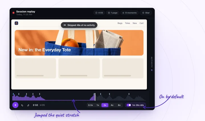
Why is my Wix site zoomed in or changing size?
If it looks zoomed in on only one computer, that browser is probably zoomed for your site: press Ctrl+0 (Cmd+0 on a Mac). If elements grow and shrink with the window, that's how the design works: Studio elements that scale proportionally grow with the screen up to the max width, and Wix Editor strips stretch to fill it.
- Browser zoom. Reset it with Ctrl+0 (Cmd+0 on a Mac). Chrome lists the sites you've zoomed under Settings > Privacy and security > Site Settings > Additional content settings > Zoom levels, and sets the zoom for every site under Appearance > Page zoom.
- Display scaling. Check Scale in Windows' display settings, or the resolution under System Settings > Displays on a Mac.
- Studio elements that scale proportionally. To stop them growing on big screens, set the site's max width under Site Styles > Max width; it must be more than 1,001 pixels. With max width turned off, every section keeps scaling up on larger screens. For text, set minimum and maximum font sizes with Max-min in the Inspector.
- Stretched Wix Editor elements. Strips, galleries, menus and lines stretched to full width span the browser on every screen. Side margins set in pixels stay the same, while margins in percent change with the window.
- Android phones in Chrome. Wix lists a known issue: on some Android devices, Chrome loads mobile sites zoomed in or out depending on the phone's font size setting. Its workaround for a site that loads zoomed in is a smaller font size in the phone's accessibility settings, and the latest version of Chrome.
- The editor itself. Apart from its Zoom out view, the Wix Editor has no zoom of its own and uses your browser's. Wix advises keeping the browser at 100% while you edit.
Check your site the way visitors see it
Rule out your own computer first, then try the widths your visitors use.
- Publish, then open the live site in a private window: Ctrl+Shift+N in Chrome or Edge, Cmd+Shift+N in Chrome or Safari on a Mac, or Ctrl+Shift+P (Cmd+Shift+P on a Mac) in Firefox. If it looks right there, clear your browser's cache.
- Reset the zoom with Ctrl+0 (Cmd+0 on a Mac), and note the computer's display scaling.
- Try other widths. In Wix Studio's Preview, choose a device or type a width; in Wix Harmony's Preview, drag the slider; on any site, make your browser window narrower and wider.
- Try another supported browser, and turn off browser extensions, which Wix lists as a cause of local problems.
- Switch custom code snippets off one at a time under Settings > Custom Code, and reload the site after each. Wix doesn't support third-party code, so a snippet that causes the problem goes back to its provider; why custom code stops working has more checks.
See the page at your visitors' window sizes
Your own checks show your screens; replays show your visitors'. Session Recordings rebuilds each recorded visit at the window size the visitor's browser reported, then scales it down to fit your player, never up. A wide monitor, a small laptop and a zoomed-in browser each replay in their own shape, with the layout that width gave them.
Zoom shows up too: zooming in leaves the page fewer CSS pixels, so a zoomed-in visit replays as a narrower window. The replay can't tell you whether a window was zoomed or just small, but the layout is the one the visitor got.
The list of replays doesn't show devices or window sizes, so open visits to the page that looks wrong and look at their shape. A visit's first Page view row names the page it started on; for a later page, play the visit at 4x or 8x until it comes on screen. Then watch for:
- A page that slides sideways. If it shifts left and right as the visitor scrolls, something on it is wider than their window, such as content outside the gridlines on a Wix Editor site.
- Content cut off at the edge. In Studio's Preview, drag the width until your page matches the replay, then set that editing size and fix the layout there. On a Wix Editor site, move the content inside the gridlines.
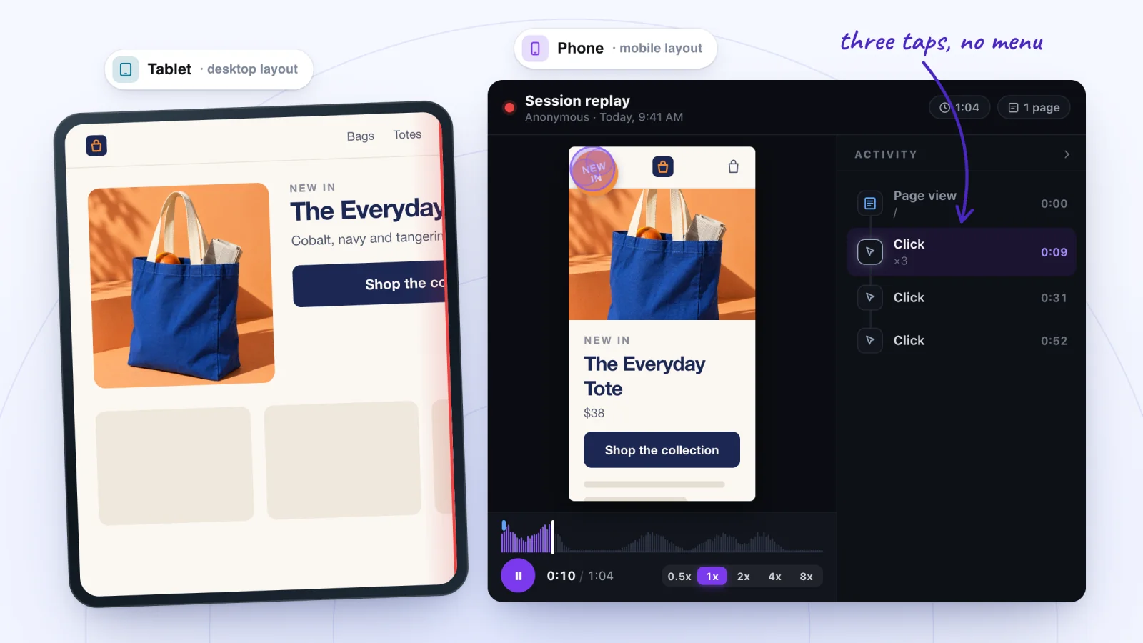
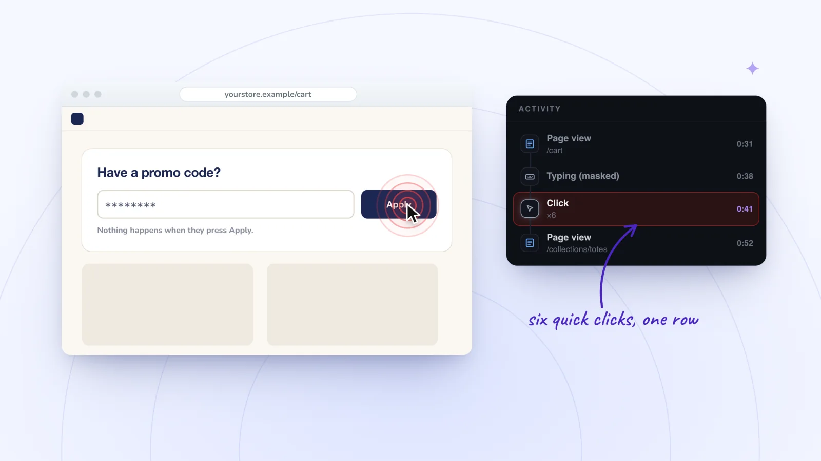
- Clicks that get no response. Quick clicks in a row merge into one Click row with a count, such as ×3. At some widths an element can end up over a button, so check for something covering the element.
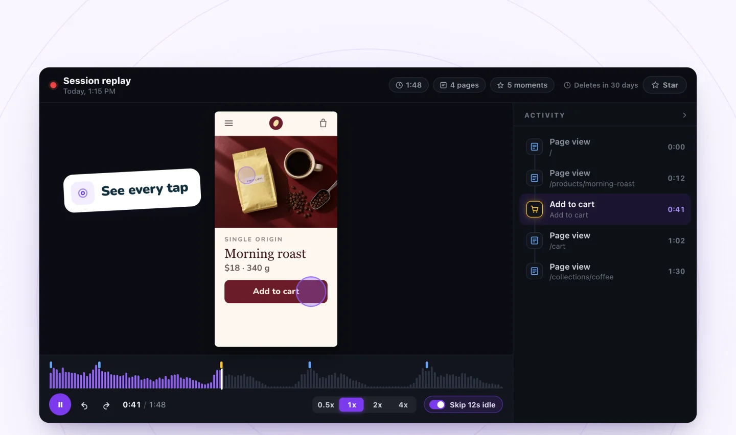
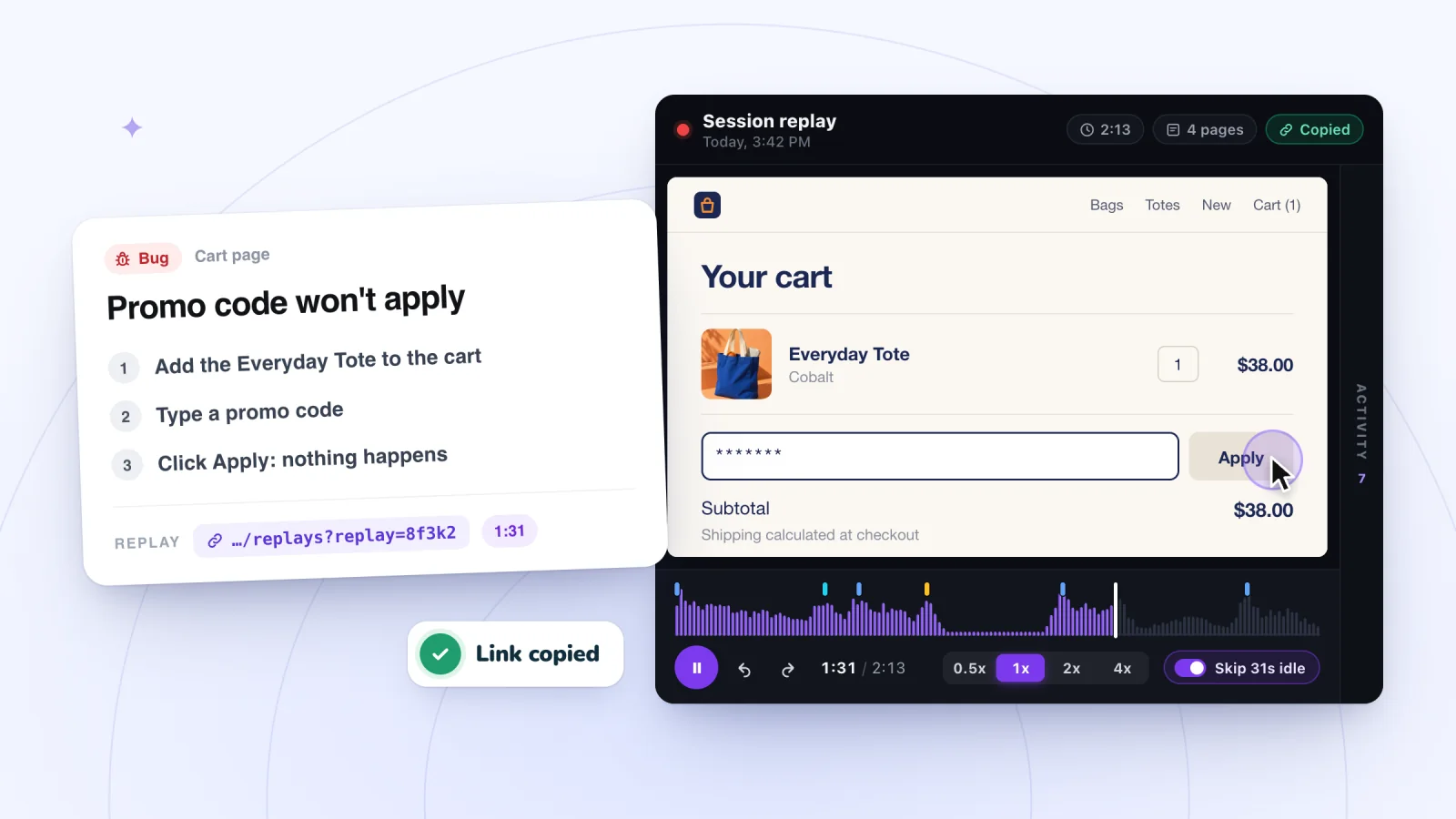
What a replay can't show is how the visitor's browser drew the page. It's rebuilt inside a frame in your own browser, so a font or rendering quirk from theirs won't appear, and text that wrapped on their screen may not wrap on yours; what a replay can't show has the details. A visit is also saved only once the visitor clicks, taps or types, so someone who saw a broken page and left without touching it leaves no replay. When you find a problem that someone else will fix, write the bug report from the replay.
Frequently asked questions
How do I make my Wix site fit all screens?
In the Wix Editor, keep text, images and buttons inside the gridlines, use full-width sections, strips, galleries and menus, which adjust to the visitor's screen, and check the mobile layout. In Wix Studio, design each breakpoint, use proportional scaling with a max width, and try different widths in Preview.
Can I change the page width in the Wix Editor?
No. The area between the gridlines is fixed at 980 pixels. Elements with a Stretch option, such as strips, galleries, horizontal menus and lines, can span the full browser width instead. Wix Studio works differently: you set one max width for the whole site, and it must be more than 1,001 pixels.
Why does my Wix site look different in Preview?
Preview isn't the live site: changes reach the live site only when you click Publish, and a change that shows in Preview but not on the live site can be a caching issue. In Wix Studio, Preview starts at your current screen size, so check which breakpoint you're seeing and drag the handles to try other widths.
Why does my Wix editor look different?
You may be in a different editor. Wix released Wix Harmony alongside the Wix Editor in January 2026: Harmony keeps its main actions, such as Add, Brand and Pages, along the top, while the Wix Editor has a panel of large icons on the left. Wix also says high browser zoom or device accessibility settings may affect the editor's interface.
Why is there a gap below the footer on my live site?
Wix says it happens when the content on a page is shorter than the page's length. Its fixes: match the page background to the footer's color, add content (a gap can still show on larger screens), make the footer taller, or look for hidden elements in the Layers panel.
Try it on your site
To see your pages at the window sizes your visitors really use, add Session Recordings and open a few visits to the page that looks different. Each one replays in its visitor's window shape, and it's free for 2,000 recordings a month. See session replay for Wix sites.

Sources
All checked October 6, 2026.
- Wix Editor: Publishing Your Site
- Wix Editor: Differences in Live Site and Editor
- Studio Editor: Saving, Previewing and Publishing Your Site
- Wix Harmony Editor: Previewing and Publishing Your Site
- Wix Harmony Editor: The Difference between Wix Editor and Wix Harmony
- Wix: Viewing and Managing Your Site History
- Wix: Clearing Your Browser's Cache
- Wix: Opening Your Browser in Incognito/Private Browsing Mode
- Wix: Supported Devices, Browsers and Operating Systems
- Wix Technical Assistant
- My Site Looks Different on Other Devices and Screens
- Wix Editor: Working With the Editor Gridlines
- Creating Responsive Sites With Wix
- Wix Editor: Removing Horizontal Scroll Bars from Your Live Site
- Wix Editor: Fixing Spacing and Alignment Issues on Your Site
- Wix Editor: Stretching an Element to Full Width
- Wix Editor: Changing the Zoom in the Editor
- Studio Editor: Designing Across Breakpoints
- Studio Editor: Setting the Site's Max Width
- Studio Editor: Troubleshooting Differences Between the Editor and the Live Site
- Studio Editor: Troubleshooting Responsiveness Issues
- Studio Editor: Setting Your Editing Size
- Accessibility: About Zoomed Content
- Mobile Live Site Loads Zoomed In/Out on Android Chrome (Includes Workaround)
- MDN: Viewport concepts
- MDN: Window.devicePixelRatio
- Google Chrome Help: Change text, image and video sizes (zoom)
- Apple Support: Zoom in on webpages in Safari on Mac
- Apple Support: Change your Mac display's resolution
- Microsoft Support: Change the size of text in Windows
- rrweb: sandboxed replay

We build marketing apps for online stores: myuser.ai writes and sends emails and texts from a store's own products, and we make Session Recordings and Spin Wheel for Wix sites. Product details in our guides are checked against the apps themselves.