
What's my screen size? Window, screen and browser
See your browser window's size in CSS pixels, your screen's size and resolution, and your browser and system, then copy them for a bug report. Send this page to a customer who says your store looks wrong on their phone.
- Pixel ratio
- –
- Orientation
- –
- Touch screen
- –
- Browser
- –
- System
- –
- Color scheme
- –
- Language
- –
- Time zone
- –
- Cookies
- –
Read from this browser as you look; resize the window or turn your phone and the numbers follow. Nothing is sent or stored.
What the numbers mean
- Browser window. The page's width and height in CSS pixels, the unit layouts and media queries use. It's the number that decides which layout your store shows.
- Screen. The whole screen in CSS pixels. Multiply by the pixel ratio for its resolution in physical pixels.
- Pixel ratio. Physical pixels per CSS pixel: 2 or 3 on most phones, which is why their text looks sharp.
- Orientation and touch. Turning a phone or tablet sideways changes the window's width, and with it, sometimes, the layout.
- Browser and system. Read from what the browser says about itself, which some browsers blur on purpose.
Which layout does a store show at this width?
- Wix Studio picks a layout by width: Desktop from 1001px, Tablet from 751 to 1000px, and Mobile up to 750px. You can add more breakpoints of your own.
- The Wix Editor gives phones a separate mobile layout, built from your desktop one, and gives tablets, iPads included, the desktop layout. Why a Wix site looks wrong on phones covers both editors.
- Shopify themes set their own breakpoints, so the width a layout changes at depends on your theme. Resize your browser window over your store and watch where it switches.
When a customer says your store looks wrong
- Send them this page. Press Copy a link to this page, send it, and ask them to press Copy the details and paste what it copies into their reply.
- Match their window. Set your browser to the same width, or use your browser's device toolbar, and open the page they were on.
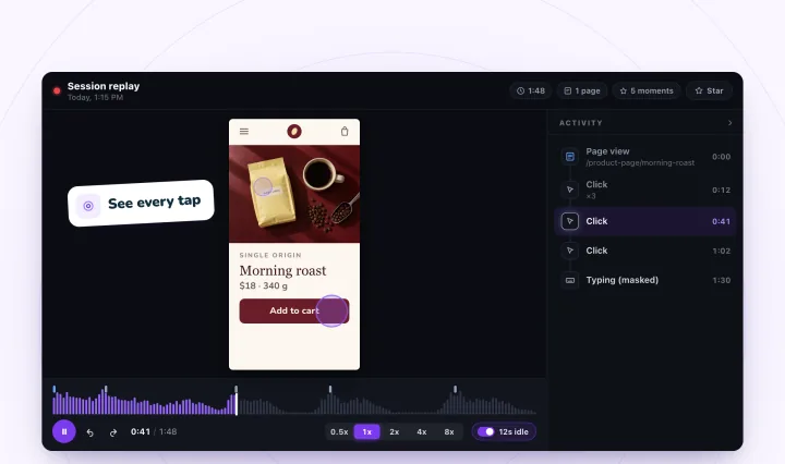
- Watch a visit at that size. A replay plays a phone visit at the phone's own size, so you see the layout the visitor saw. Session replays for bug reports shows what to look for, and phone visits covers what a replay shows on a phone.
See your store at your visitors' screen sizes
Session Recordings replays each visit at the visitor's own screen size, and its heatmaps keep computers, tablets and phones apart. Free forever: 2,000 recordings a month.
Screen sizes, answered
What's the difference between screen resolution and viewport size?
Resolution counts the screen's physical pixels. The viewport is the browser window's size in CSS pixels, the unit layouts use: on a phone with a pixel ratio of 3, a viewport 390 pixels wide fills a screen 1,170 physical pixels wide.
Why is my browser window smaller than my screen?
The window is the part of the screen the page gets: the browser's bars, a window that isn't full screen and a scroll bar take the rest. Zoom changes it too: at 125% zoom, a window 1,440 pixels wide lays pages out like one 1,152 pixels wide.
Is the browser it shows always right?
Not always. It's read from what the browser says about itself, and some browsers report a desktop version or an older system on purpose. iPads ask for desktop sites by default and say they're a Mac, so the page counts a Mac with a touch screen as an iPad.
Which screen size does Session Recordings record?
A replay plays at the visitor's own window size, so a phone visit replays at the phone's size. The heatmaps file each visit by the window's width: up to 750 pixels is Phones, 751 to 1,000 is Tablets, and wider is Computers, unless the visitor touched the screen, which makes it Tablets.
Does this page save or send my details?
No. It reads them in your browser to show them, and they go nowhere unless you copy them. Like every page on this site, it has a small cookieless visit counter, which counts the page view and the first press of each button, never the details.
See your next visit through your visitor's eyes
Install it on Shopify and switch it on in your theme, or add it to your Wix site. Recording starts with your next visitor.