 Session Recordings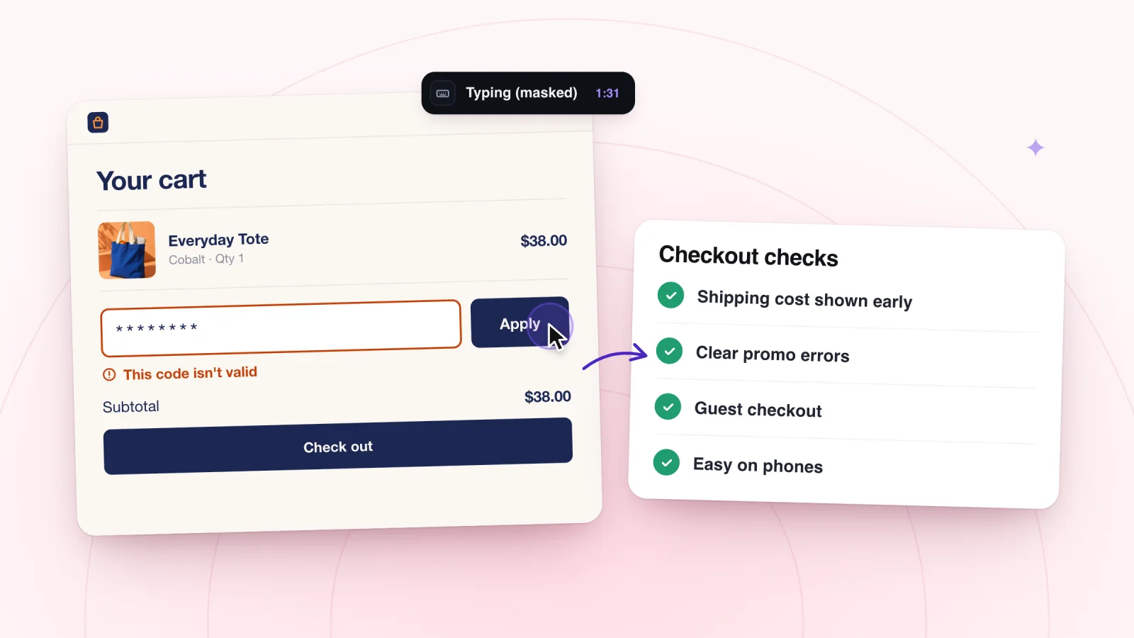
On this page
A shopper at checkout has already decided to buy. The friction that stops them here can be small, like a field that rejects a phone number or a total that changes on the last step. This checklist walks through checkout in order, with what to watch for in replays and what to check on your own site.
Key takeaways
- Show taxes, fees and duties before the final step, and add no new fees at the end.
- Offer guest checkout, and ask only for the details you need to deliver the order.
- Place a real test order on a phone and a computer after any change to shipping, taxes or payment.
- When several steps have problems, fix the one nearest the cart first, since every shopper passes through it.
How to use this checklist
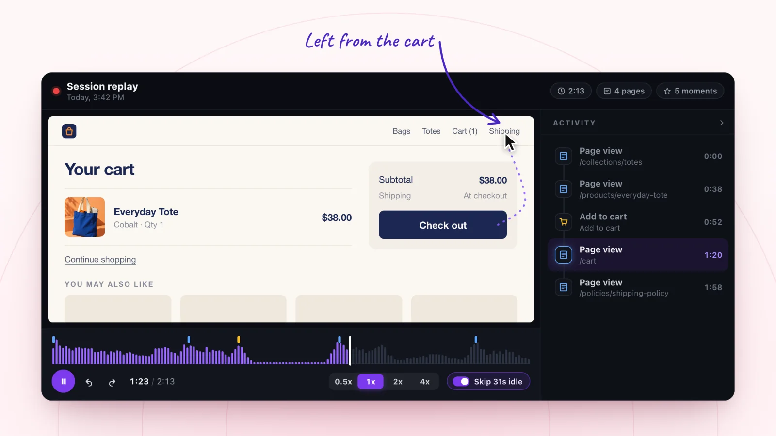
Filter to Added to cart, then open visits whose timeline includes a checkout moment. Jump to that moment and watch what happens around it.
Some parts of checkout, such as card fields run by your payment provider, sit outside your own pages. Place a real test order on a phone and on a computer to check those parts yourself. Do it again after any change to shipping, taxes or payment settings.
Step 1. The cart page
The cart is the doorway to checkout. Check that it is easy to walk through.
- The checkout button is visible on a phone without scrolling.
- Each line shows the photo, option, quantity and price.
- Changing a quantity updates the total right away.
- A "continue shopping" link is there, but quieter than the checkout button.
Watch for visitors scrolling up and down the cart looking for the way forward, or tapping "continue shopping" by mistake.
Step 2. Costs that change between steps
A total that grows after the shopper enters an address can feel like a trick, even when every charge is fair. Taxes, duties and handling fees can all do this.
- Show an estimate of taxes and fees in the cart, or say plainly that they are added later.
- If you ship abroad, say whether duties are included.
- Keep the order summary easy to open on phones, where it may start out collapsed.
- Add no new fees on the final step.
Watch for visitors opening the order summary several times, going back a step after entering an address, or leaving right after the total updates. For shipping costs that surprise people in the cart, see why customers abandon carts.
Step 3. Account walls
Asking a new shopper to create an account before they can pay adds a step they did not plan for.
- Offer guest checkout, and make it easy to see.
- Offer an account after the order, when their details are already filled in.
- If signing in is optional, say so.
- Show password rules next to the field before the shopper starts typing.
Watch for visitors who land on a sign-in page and go back, tap "forgot password," or start an account and stop at the password field.
Step 4. Form fields
Every field is a small job, and each job is another place to stop.
- Ask only for what you need to deliver the order.
- Mark optional fields as optional.
- If you require a phone number, say why, for example "for delivery updates."
- Use address lookup if your checkout offers it.
- Keep fields in the order of a shipping label, from name down to ZIP or postal code.
Watch for long pauses on one field, a field tapped and left without typing, and a field typed, cleared and typed again, which can mean the entry was rejected.
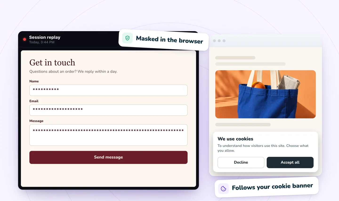
Watch shoppers move from product to checkout
Store moments are marked on every replay, and filters find the carts that never became orders.
Add to Wix, it's free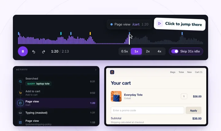
Step 5. The coupon box
A visible coupon box tells every shopper that codes exist. A shopper without one may leave to look for one and not come back.
- Tuck the box behind a small "Have a code?" link.
- If a sale applies to everyone, apply the discount automatically where your store supports it, so no code is needed.
- Put current offers somewhere easy to find, so code hunters can stay on your site.
- Before launching a code, check the numbers with a discount break-even calculator.
Watch for a visitor reaching the coupon box and then leaving checkout for your home page or another page, or ending the visit there. For codes that fail when shoppers try them, see the cart guide linked above.
Step 6. Payment options
A shopper who does not see their preferred way to pay may stop at the last step.
- Show accepted payment methods early, in the cart or your site footer.
- Offer digital wallets and express payment buttons if your store supports them.
- If you offer payment in installments, mention it near the price on product pages too.
- Keep short reassurance near the payment fields, such as a note on security and a link to your returns policy.
- Warn shoppers before sending them to another page to pay.
Watch for visitors scrolling the payment section, going back a step, or leaving as soon as they reach it. Test this step yourself too, since parts of it may run inside your provider's frame.
Step 7. Errors
An error at checkout puts a nearly finished sale at risk.
- Show each error next to the field it belongs to, in plain words.
- Keep everything the shopper entered when an error appears.
- Make sure the error is visible on a phone without scrolling.
- Make a few mistakes on purpose, like a missing field or a wrong ZIP code, and read the messages shoppers would see.
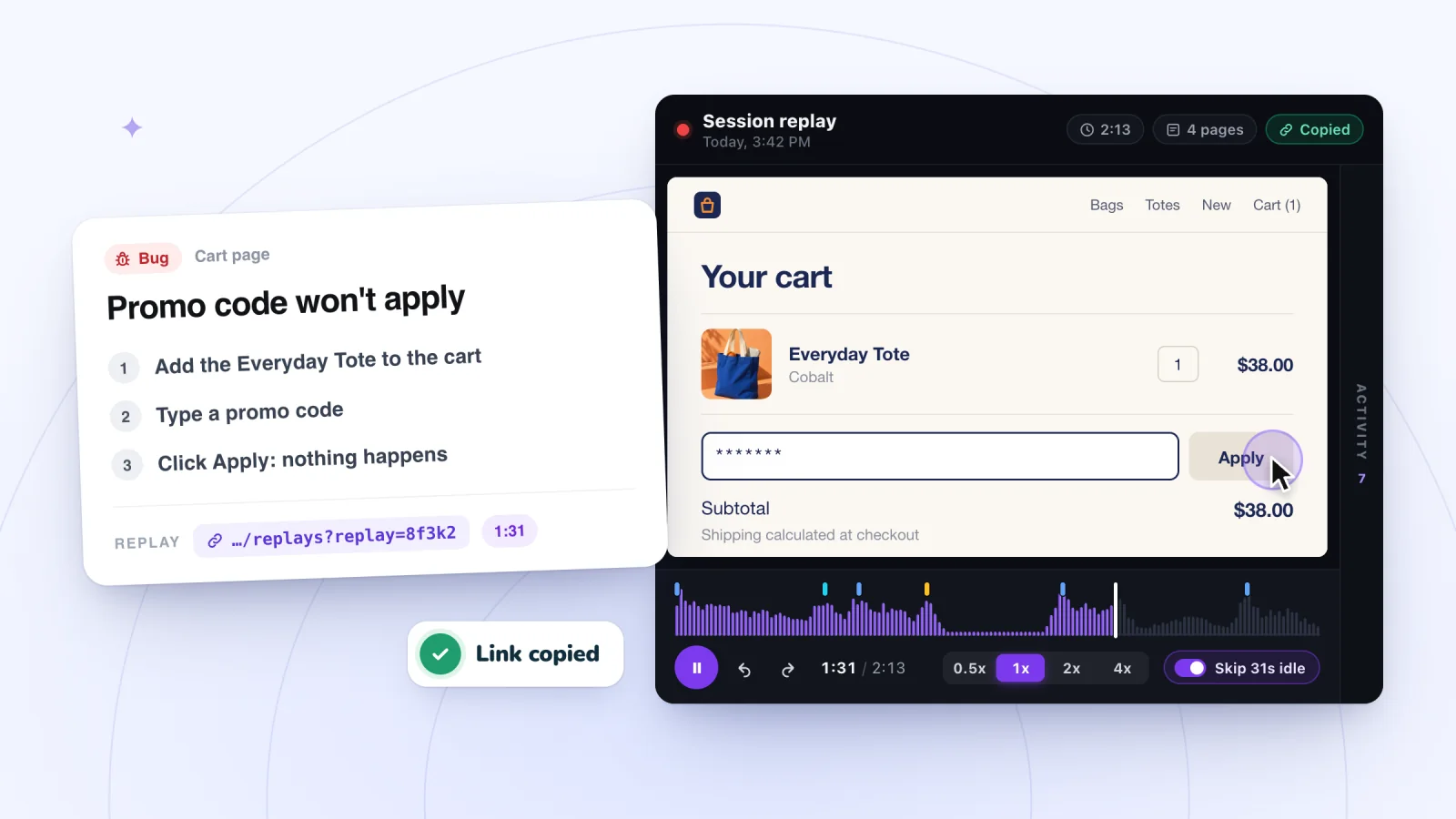
Watch for a submit tap followed by the same page, a visitor scrolling up to hunt for what went wrong, and several submit taps in a row. If you find something truly broken, turn the replay into a bug report.
Step 8. The confirmation page
The order is placed. Now the shopper needs to know it worked. A clear confirmation keeps them calm and saves you worried emails.
- Show the order number, the items and the total.
- Say what happens next and when, such as "You will get a shipping email within two days."
- Offer an account here, if you did not require one earlier.
- Keep pop-ups and offers off this page, or keep them small.
Watch for visitors who reload the confirmation page, go back a step, or head to your contact page right after paying. They may not be sure the order went through.
Fix the earliest snag first
If you find problems at several steps, start with the one nearest the cart. Every shopper passes through the early steps, and only some reach payment, so an early fix helps the most people.
Even a smooth checkout will not keep every shopper. Some will still leave, and cart reminder emails and texts can bring them back when they are ready.
Frequently asked questions
What is checkout friction?
Checkout friction is anything that slows a shopper down or makes them doubt the purchase between the cart and the confirmation page. Common examples are forced account creation, extra form fields, costs that appear late, unclear errors and missing payment options. Each one is small, but together they can stop a sale the shopper had already decided to make.
How do you test your own checkout?
Place a real order as a first-time shopper would, once on a phone and once on a computer. Try a coupon, change a quantity, leave a field blank and enter a wrong ZIP code to read the errors. Then cancel or refund the order. Repeat the test after any change to shipping, taxes or payment settings.
How many steps should a checkout have?
There is no single right number. Each step should be clear, ask only for what it needs and show what comes next, and no step should add a surprise cost. One crowded page can feel harder than three simple ones. Watch replays for the steps where shoppers go back or leave, and fix the earliest one first.
Try it on your site
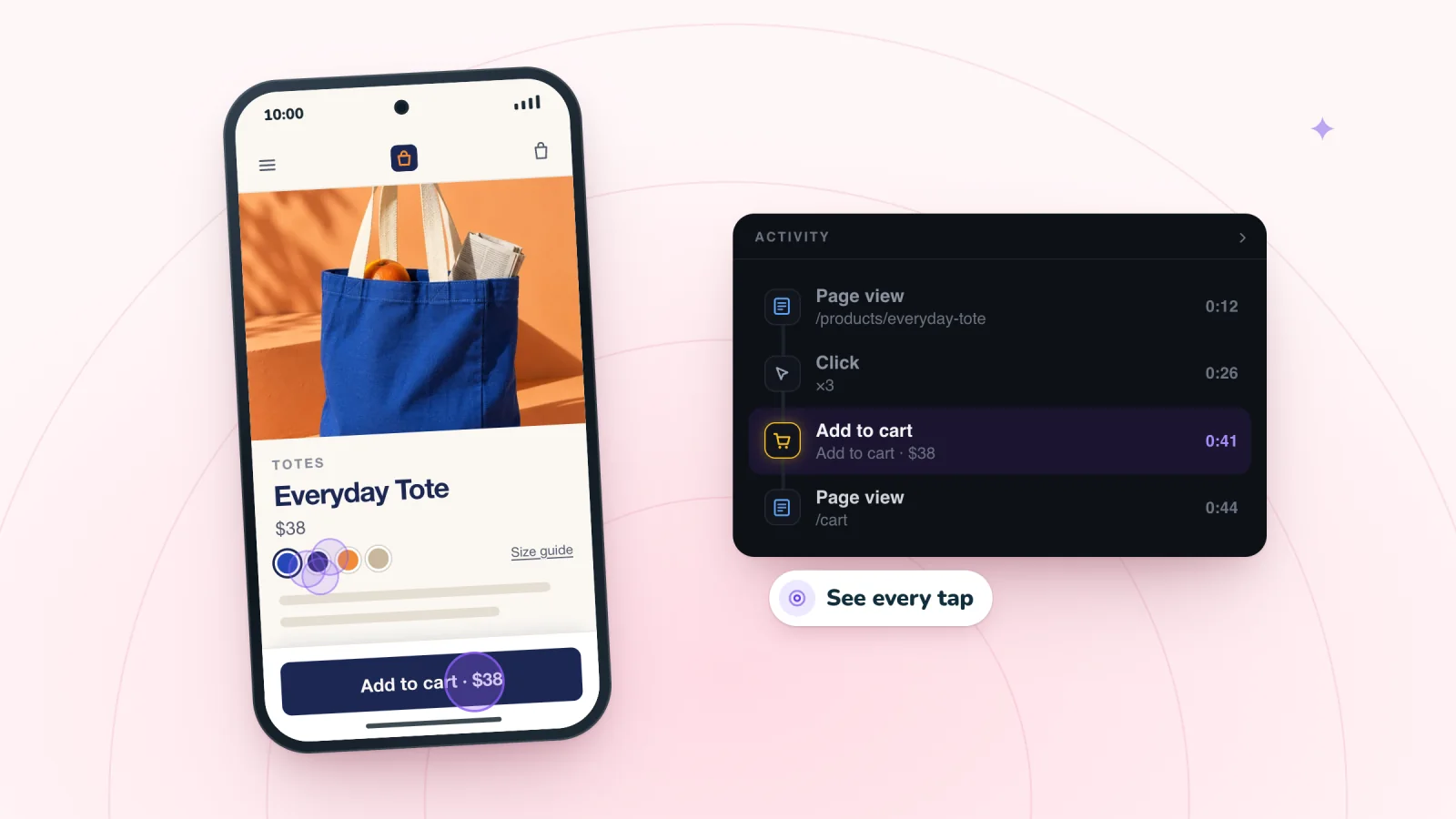
Session Recordings marks checkout on the replay timeline, so you can jump straight to that moment in each visit that reached it. See how it works for stores on the ecommerce recording page.

We build marketing apps for online stores: myuser.ai writes and sends emails and texts from a store's own products, and we make Session Recordings and Spin Wheel for Wix sites. Product details in our guides are checked against the apps themselves.