 Session Recordings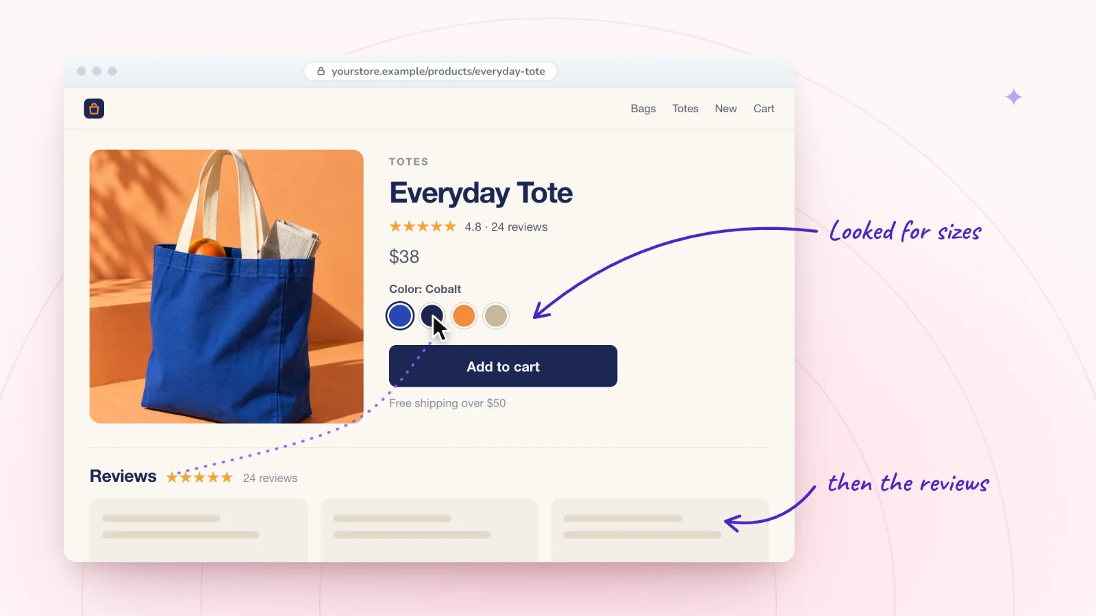
On this page
A product page needs to give a shopper enough confidence to add the item to the cart. When it falls short, your analytics show the drop. Replays show which part of the page let the shopper down, whether it was the photos, the options, the sizing or a missing answer. That tells you where to start when you improve the product page.
Key takeaways
- Compare visits that added to cart with ones that did not, on the same product page.
- Put the size guide, delivery estimate and return window right next to the options and price.
- Show options as buttons when there are few, mark sold-out choices, and change the photo when a color is picked.
- Keep the add to cart button high on the page, near the price and options, with long descriptions below it.
Watch visits in pairs
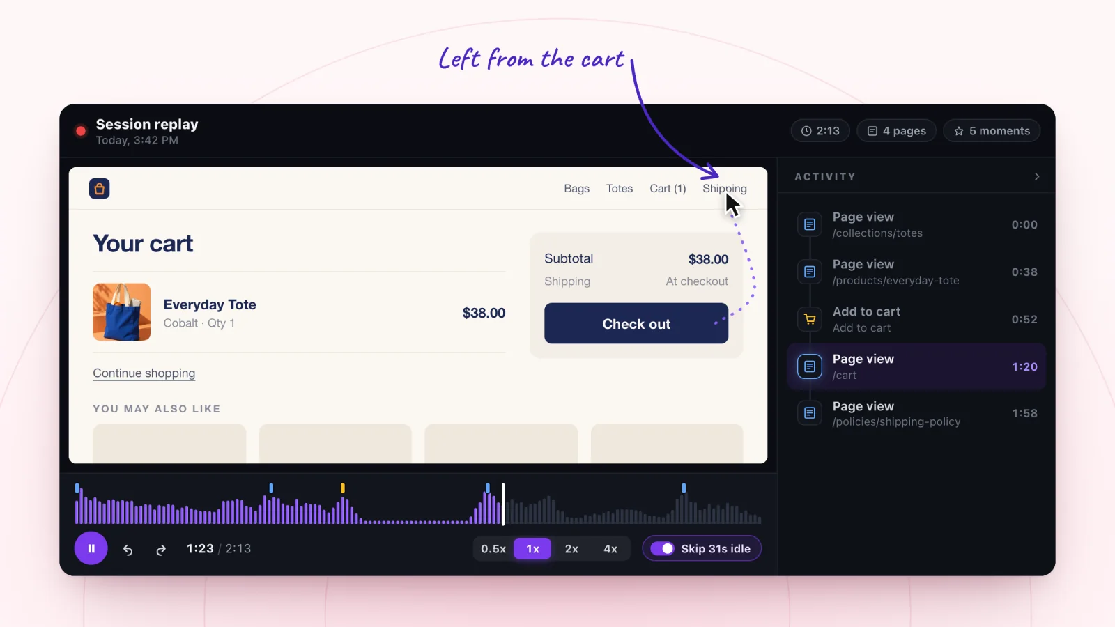
Filter to Viewed a product and choose one product page to focus on. Open two kinds of visits to it, ones that went on to add to cart and ones that did not. The add to cart moment is marked on the replay timeline, so the two groups are easy to tell apart.
Watching them back to back shows what the buyers found that the others missed. Say both groups scroll down to the size options. The buyers open the size guide and then add to cart. The others never notice the size guide link, and they leave. That points to a fix far more precisely than a page-level number can.
Images
What to watch. Which photos visitors look at, which one they return to, and whether they scroll back up to the photos after reading the description. A visitor who goes back to the photos is still unsure about something only a picture can answer.
What to fix.
- Show the product to scale, held in a hand or next to a familiar object.
- Show the back, the inside, the texture and any detail a shopper would check in person.
- Move the photo visitors keep returning to into the first spot.
- Add a short caption with the dimensions under the scale photo.
Variant pickers
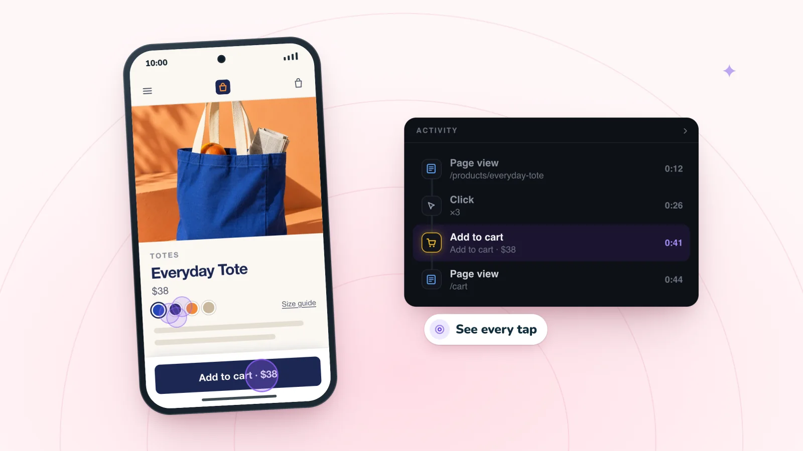
What to watch. Clicks on Add to cart before a size is chosen, followed by an error or no change at all. Repeated clicks on a sold-out option. A visitor switching colors while the main photo stays the same. A dropdown opened and closed several times.
What to fix.
- Show options as buttons when there are only a few, so every choice is visible at once.
- Mark sold-out options clearly, and keep them from being selected.
- Change the main photo when a shopper picks a color.
- If a choice is required, say so right next to the picker the moment they miss it.
- Preselect the option when only one exists.
- When an option costs more, show the new price as soon as it is picked.
Size guides
What to watch. A visitor scrolling the whole page and back, clearly looking for something. The size guide opened, closed quickly and opened again. A trip from the product page to your FAQ or a sizing page, and back.
What to fix.
- Put the size guide link right next to the size options.
- Build the guide as a text table, with measurements a shopper can check against clothes they own.
- Include both inches and centimeters if you ship abroad.
- Add a plain fit note, like "Runs small. If you are between sizes, size up."
Descriptions
What to watch. Long pauses on a dense paragraph, or fast scrolling straight past it. Visitors who jump between the description and the photos, as if matching words to pictures.
What to fix.
- Open with one or two sentences on what the item is and who it is for.
- Put materials, dimensions, care and what is included in a short list.
- Break long text into small sections with plain headings.
- Answer the questions customers keep emailing you about right in the description.
Watch shoppers move from product to checkout
Store moments are marked on every replay, and filters find the carts that never became orders.
Add to Wix, it's free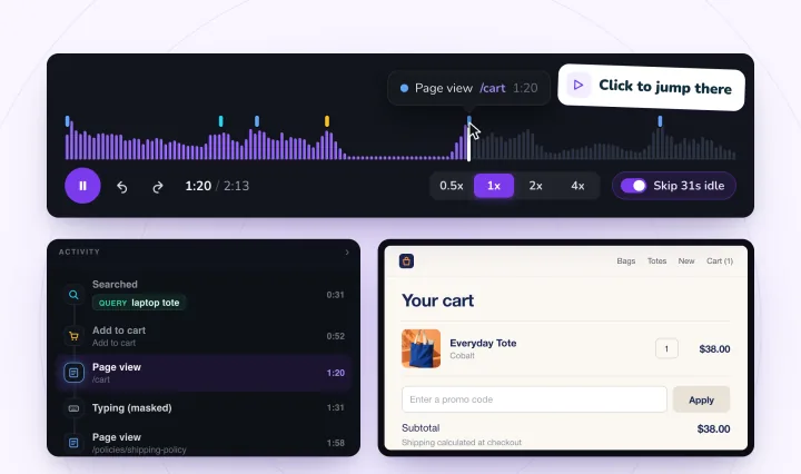
Price, delivery and returns
What to watch. Scrolling past the description to the bottom of the page. Footer links to shipping or returns opened from the product page, followed by a return to the product. Shoppers who do this want to know when the item will arrive and what happens if it does not work out.
What to fix.
- Add one line under the price with a delivery estimate and your return window, such as "Arrives in 3 to 5 business days. Free returns within 30 days."
- Link the full policies from that line, so nobody has to dig through the footer.
- If an item is on sale, show the original price next to the sale price. Before you mark something down, check where a discount stops paying for itself.
Reviews
What to watch. Visitors who scroll straight past everything to the reviews. Taps on the star rating near the product name, as if expecting it to jump to the reviews. Visitors who read the reviews and then leave.
What to fix.
- Make the star rating near the top a link to the reviews.
- Show a short summary of reviews, or two or three helpful ones, near the top.
- Reply to critical reviews politely. Your reply is part of what the next shopper reads.
- If a product has no reviews yet, add other reassurance, like materials, care instructions or a guarantee.
Related products
What to watch. Visitors who tap a related product and never come back to the first one. Visitors who bounce between two similar items several times, comparing.
What to fix.
- If shoppers compare two items, add a line to each page that explains the difference, such as size, material or use.
- Place related products below the add to cart button, so they do not pull attention away before the shopper decides.
- Show related items that truly go together, like a refill or a matching piece.
The add to cart button
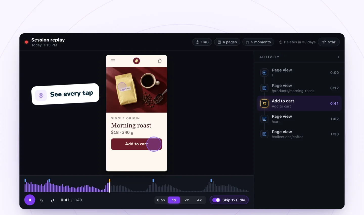
What to watch. On phones, visitors scrolling through a long description before they reach the button, then scrolling back up to check the price. Taps on the price or the product photo, as if either might add the item. A visitor who reaches the bottom of the page without ever tapping the button.
What to fix.
- Keep the button close to the price and options, high on the page.
- Give it a color that stands out from everything else on the page.
- On long pages, try a sticky add to cart bar on phones, and check that it covers nothing important when it appears.
- Keep long descriptions below the button, where they support the decision without delaying it.
Once the item is in the cart, a new set of problems can start. See why customers abandon carts for what to watch next, and mobile problems you only see in replays for phone layouts.
Frequently asked questions
What makes a good product page?
A good product page answers a shopper's questions before they have to ask. That means clear photos with a sense of scale, options that are easy to pick, sizing help next to the sizes, a short description, delivery and returns near the price, and reviews. Keep the add to cart button high on the page, close to the price and options.
Why is my product page not converting?
Often because one part of the page leaves shoppers unsure. To find which part, compare visits that added to cart with visits that did not. In Session Recordings, filter to Viewed a product, pick one page and watch both kinds back to back. Look for what the buyers found that the others missed, such as a size guide link or delivery details.
How many photos should a product page have?
There is no set number. Use enough photos to answer what a shopper would check in person: the front, the back, the inside or texture, any detail that matters, and the item to scale in a hand or next to a familiar object. If replays show visitors returning to one photo, move it into the first spot.
How long should a product description be?
Long enough to answer real questions, and short enough to scan. Open with one or two sentences on what the item is and who it is for. Then list materials, dimensions, care and what is included. Add answers to questions customers keep emailing you about, and place longer text below the add to cart button so it supports the decision.
Try it on your site
Session Recordings has a Viewed a product filter, so you can open only the visits that reached your product pages. Read more on the page for online stores.

We build marketing apps for online stores: myuser.ai writes and sends emails and texts from a store's own products, and we make Session Recordings and Spin Wheel for Wix sites. Product details in our guides are checked against the apps themselves.